SAY YES
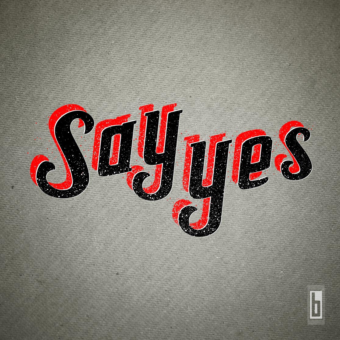
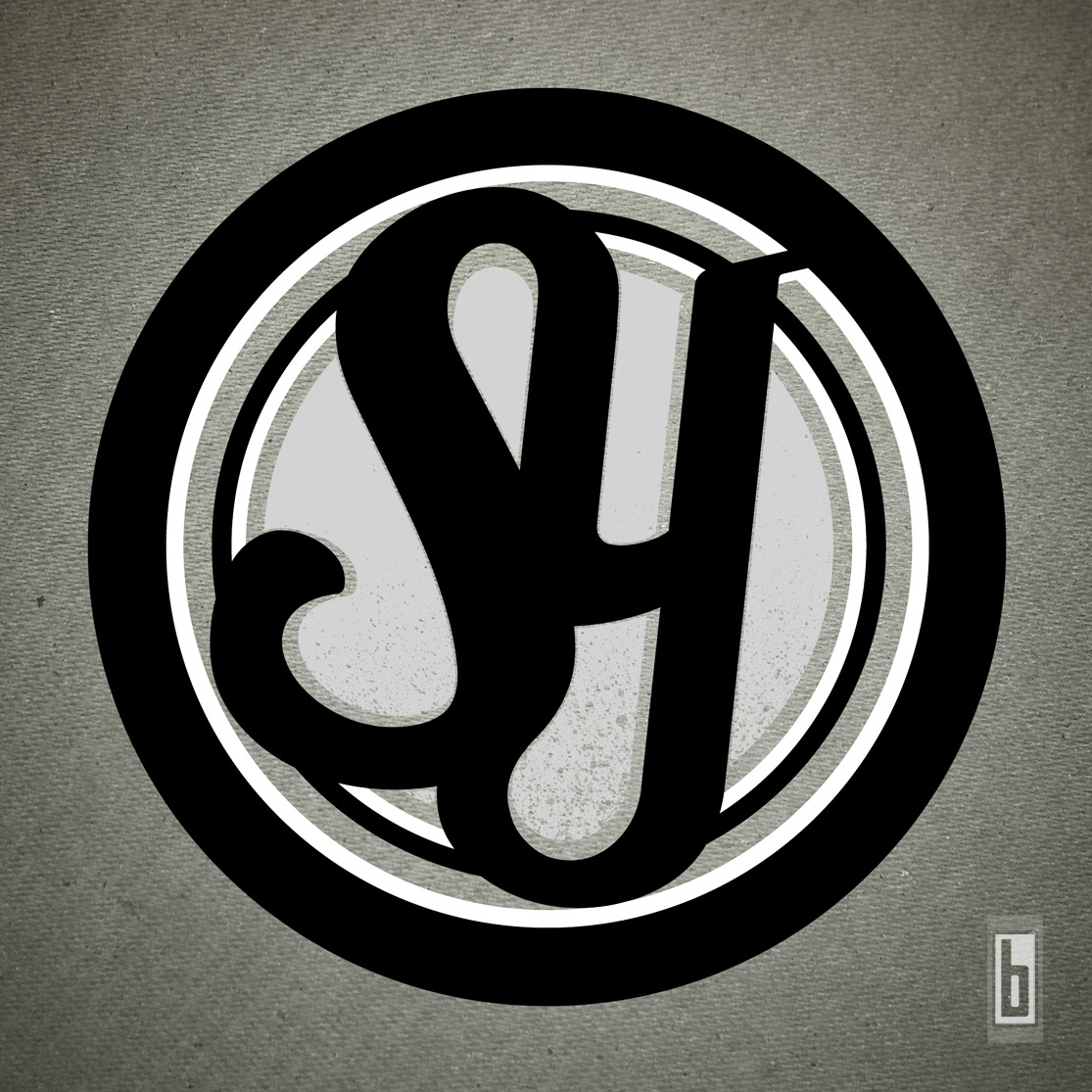
I got a rare invite in early 2013 to hang out with Say Yes in the studio (B Town Sound) to listen to their brand new recording and got to sit down and picked the boy’s brains on what their sound and buzz is all about. For their Logo, they were looking for something iconic and relative to what their sound was emulating. I ended going somewhat retro and gave the background texture a bit of an army feel. The letters have been distressed and a slight blood splatter was added to show the intensity of the band. The Stamp logo has a headlight feel to it.
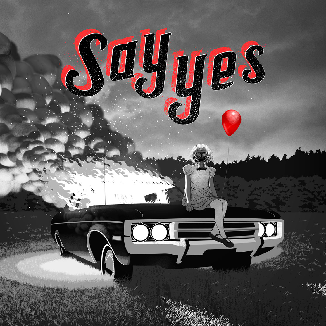
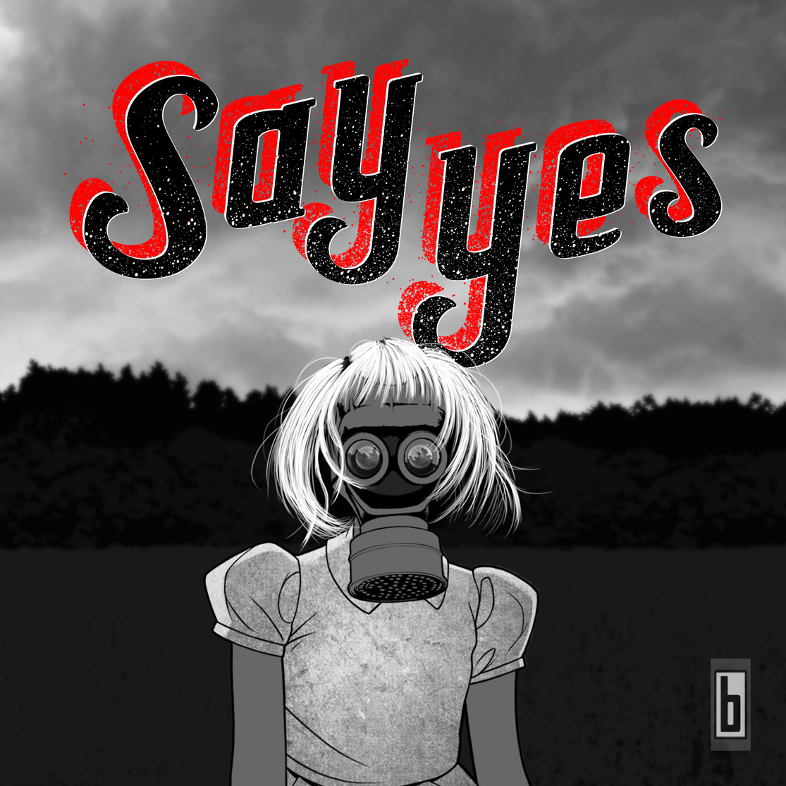
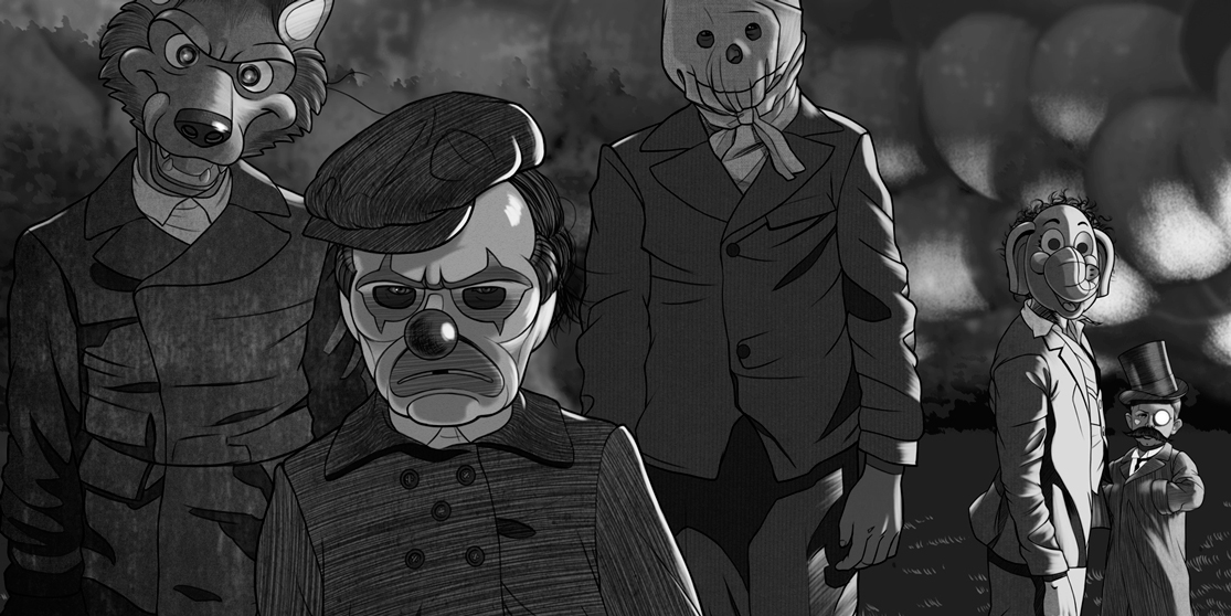
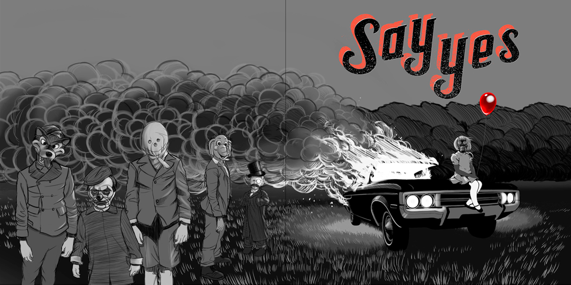
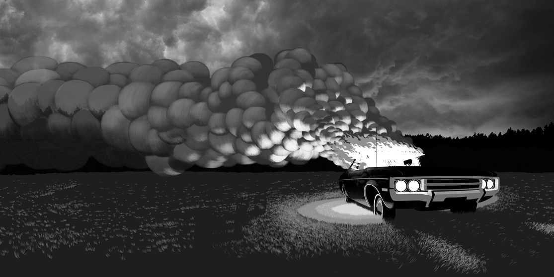
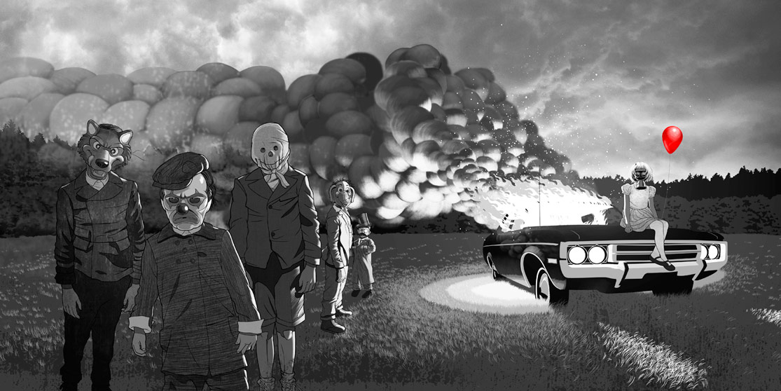
Later that year I was asked to design their 2014 self-titled debut EP. The guys wanted a creepy retro feel. All of the kids are hand traced and coloured in Photoshop. Along with the floor grass and smoke. Everything else was built in Illustrator. Released on Dine Alone Records August 18th 2014.
Extra special credit and gratitude to Mr Dustin Rabin for lending us his brilliant Toronto storm cloud photo for the background of the layout.
These guys are amazing and I’m looking forward to whatever they come out with next.
Check out – SAY YES

